The Language of Flowers, Nomenus II, 2021
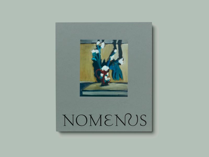
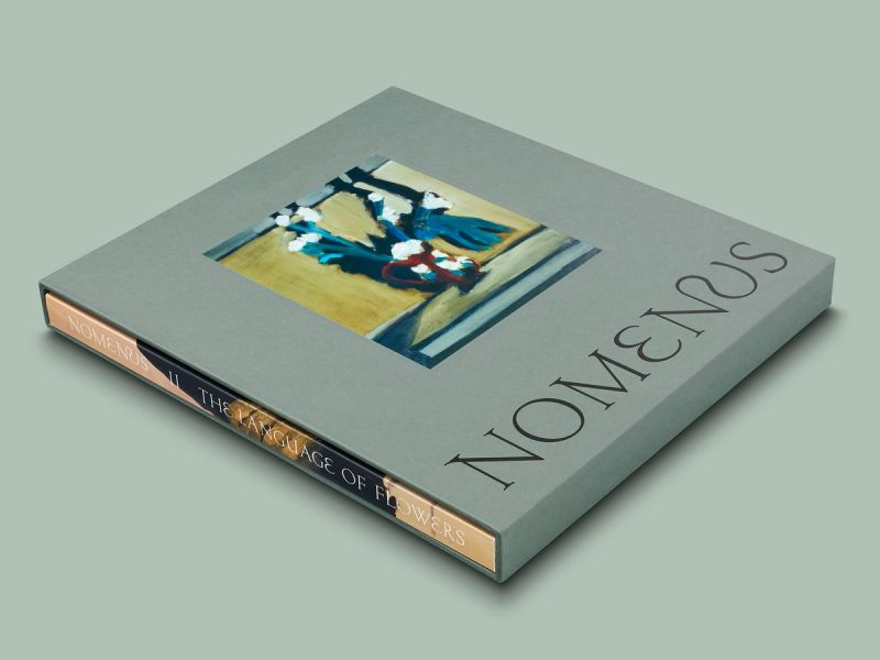
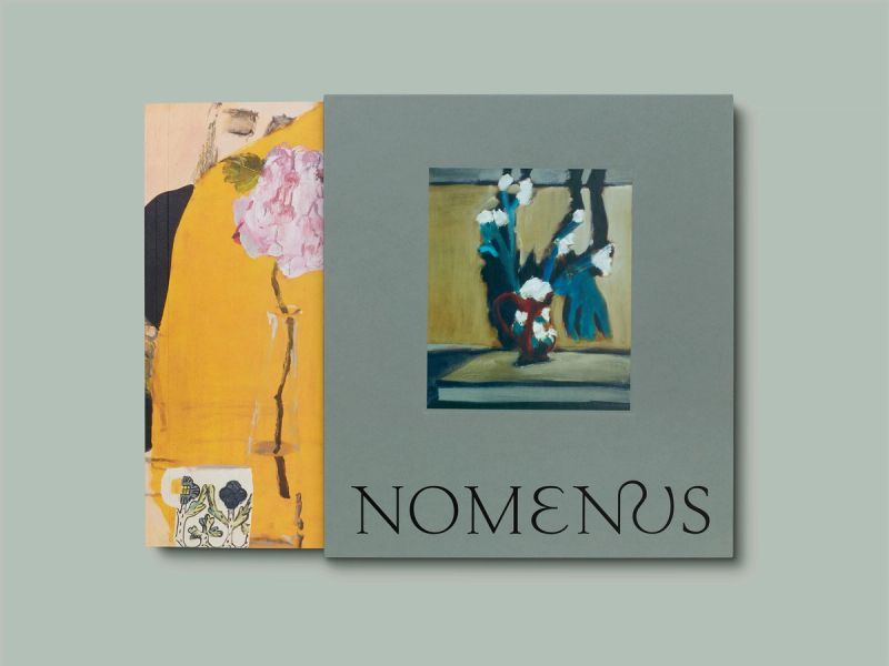
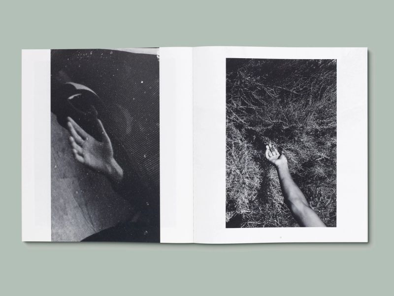
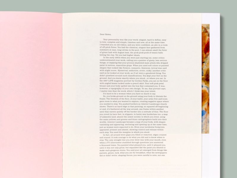
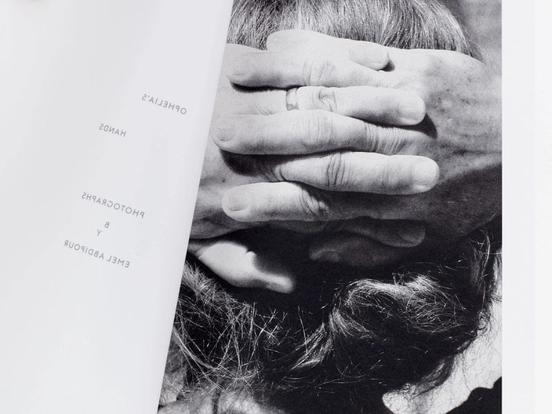
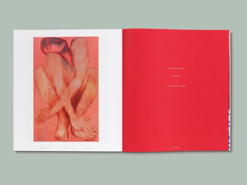
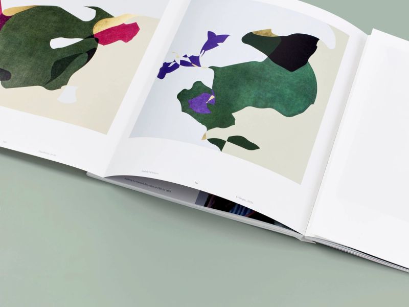
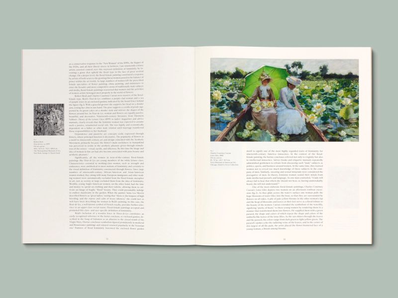
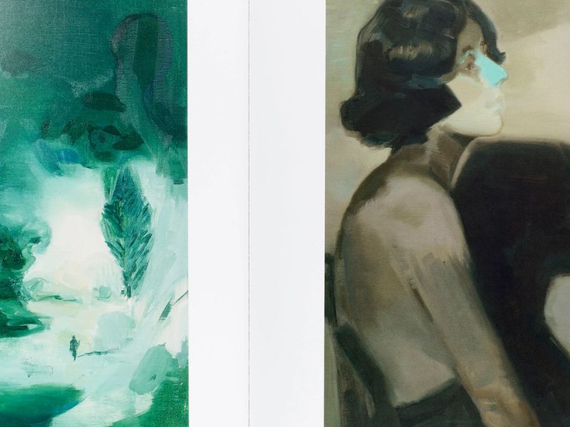
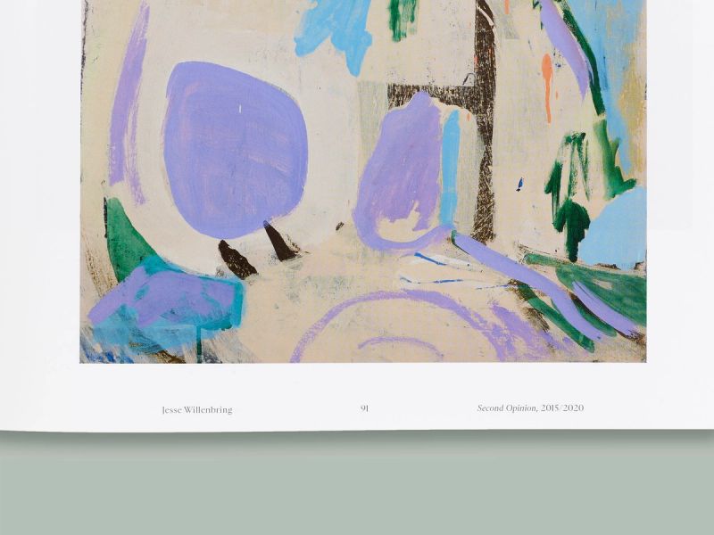
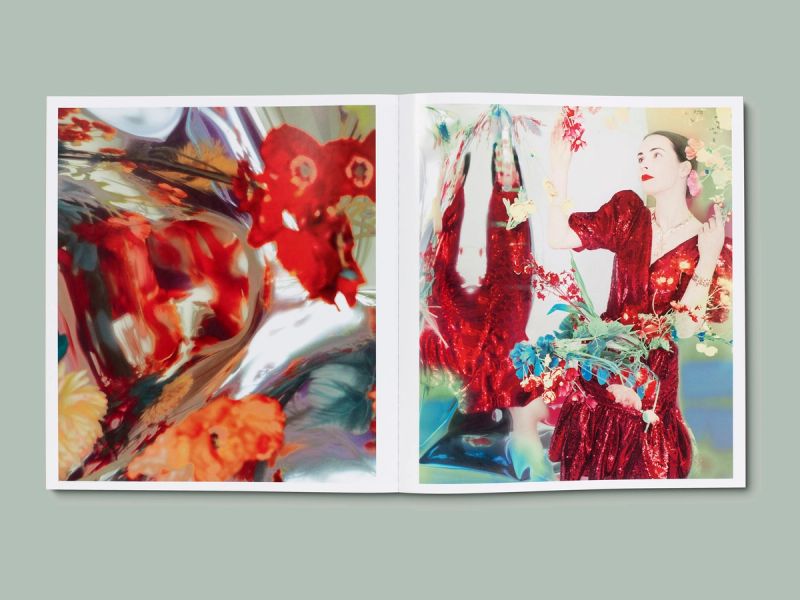
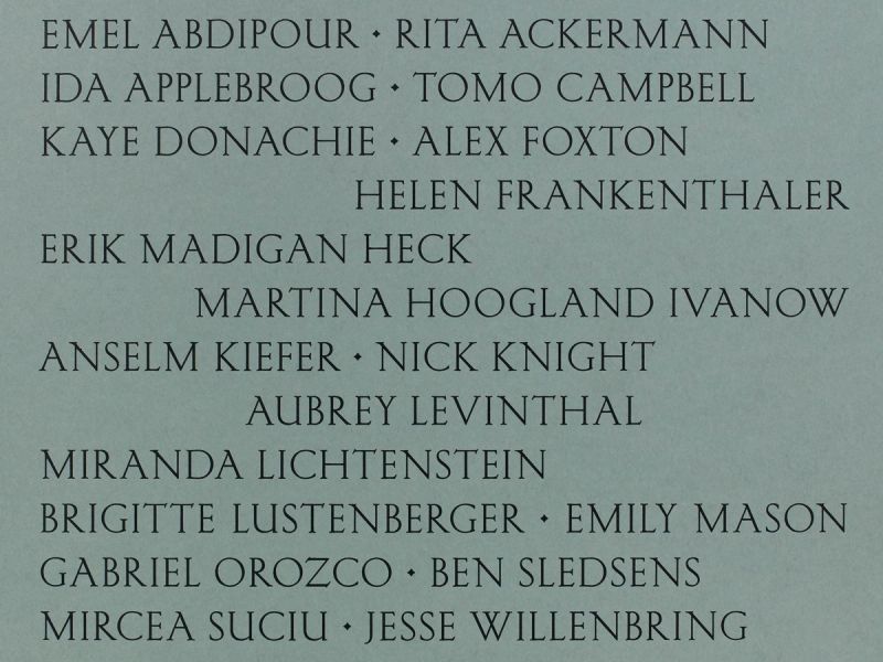
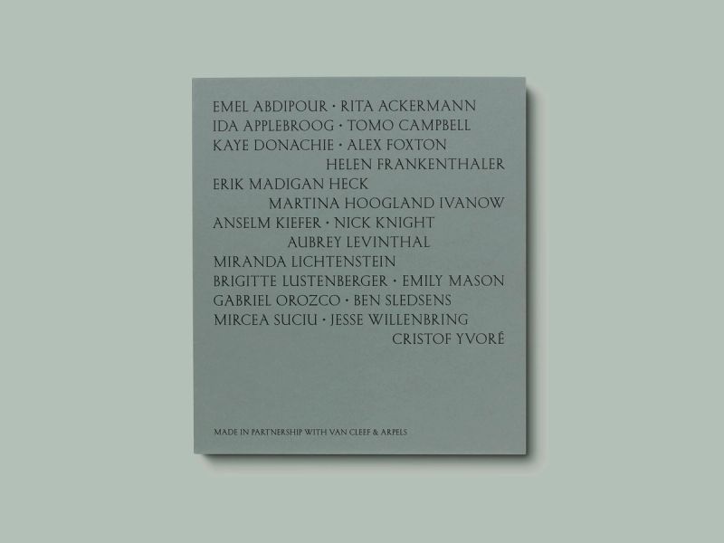


The Language of Flowers is the second installment of Nomenus curated by Erik Madigan Heck, and designed by A Practice For Everyday Life. It unites figurative contemporary paintings and photographic studies with its central focus on flora, from a range of contributors including Rita Ackermann, Ida Applebroog, Kaye Donachie, Helen Frankenthaler, Anselm Kiefer, Nick Knight and Gabriel Orozco.
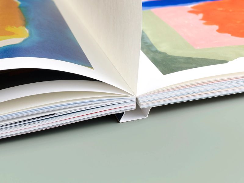
The layout and typography are inspired by early 20th-century artist monographs, with large artwork plates, immersive full-bleed details and endpapers, as well as traditionally set typography. The bespoke masthead includes an unusual ligature connecting the N and U; headings are set in A Practice For Everyday Life's Type Foundry’s Marquis – a humanist sans-serif with reference to early 20th-century British typefaces. While the expressive serif Sainte Colombe was chosen for body text and captions throughout the publication. The OTA-bound softcover book is enclosed in a paper-wrapped slipcase with foiled typography and a debossed tip-on plate.
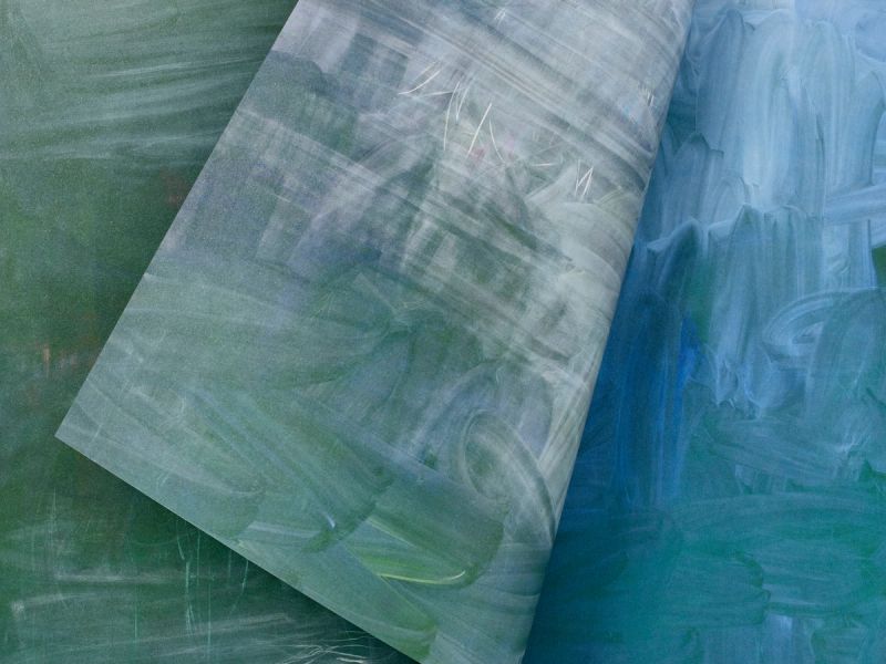
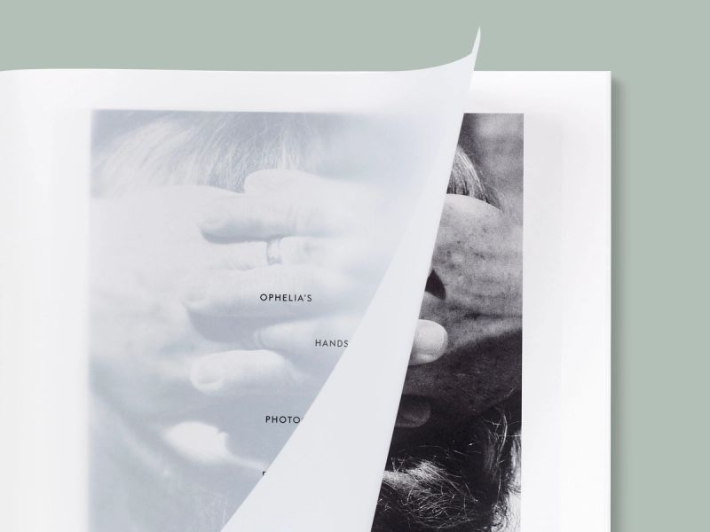
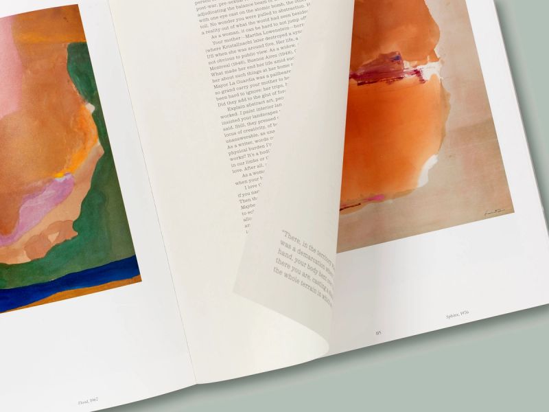
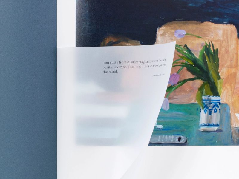
APFEL worked closely with Heck to sequence the artworks, creating conversations between the contributors on 15 paper stocks – from matte coated, high gloss, and uncoated papers. Coloured paper-dividers are used throughout, utilising the colour theme of each section with corresponding quotations printed on semi-transparent tip-in pages. Other details include a double gatefold and a cut-short section that is designed as a letter-like intervention.
Printed it an edition of 1,500 copies.