Per Calvaria
Per Calvaria is a typeface designed by A Practice for Everyday Life in collaboration with Erik Madigan Heck.
It draws its origins from the proportions of the classic 16th-century metal type Garamond- where letterforms are subverted from this historical beginning, introducing gestures of modernity through idiosyncratic details that add texture at both small and large scales.
The typeface alludes to traces of the hand – ink-bled corners, unconventional contrast modulation and uncanny serif placements – weaving a tapestry of typographic styles and motifs. Tall ascenders and raised tittles accentuate rhythm within text, while an extended suite of ligatures introduce a sense of fluidity and continuity.
The name is an anagram of Cair Paravel- the castle inhabited by The Queen of Narnia, in C.S. Lewis' The Lion, The Witch, and The Wardrobe.
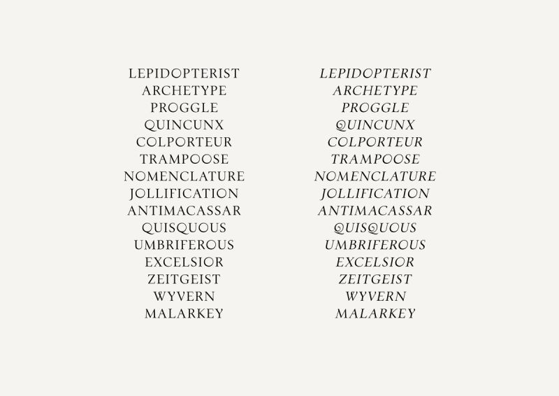
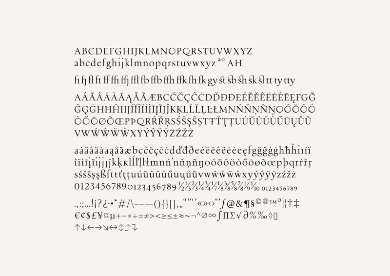
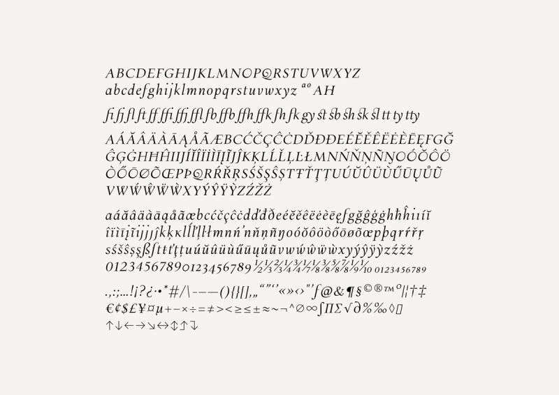
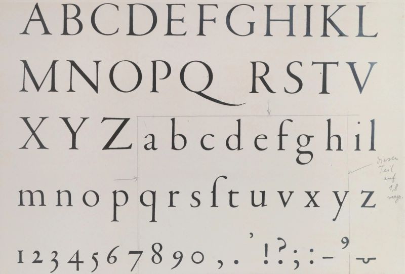
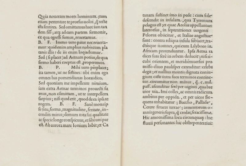
Per Calvaria is a typeface designed by A Practice for Everyday Life in collaboration with Erik Madigan Heck. It is drawn from the 16th-century metal type Garamond; and alludes to traces of the hand- with ink bled corners, unconventional contrast modulation, and uncanny serif placements.